Highlights from Umbraco Spark 2024
Our team reflects on their highlights from this years innovation focused conference.
Landing pages play a crucial role in attracting, engaging, and converting website visitors.
Continuous content improvements and conversion rate optimisation across key landing pages should be a priority for every business.
These are the tips we most often share with our clients for making the most of their flexible content components.
Users expect answers quickly. If they can't quickly understand what your product or service offers and how it benefits them with a quick glance, they are less likely to read on, and ultimately convert.
Your above the fold content needs to effectively communicate key messages to busy readers.
Your ‘hero’ component should provide structure for a heading, supporting information and call to action.
Keeping the copy concise, compelling, and giving users a reason to act is essential.
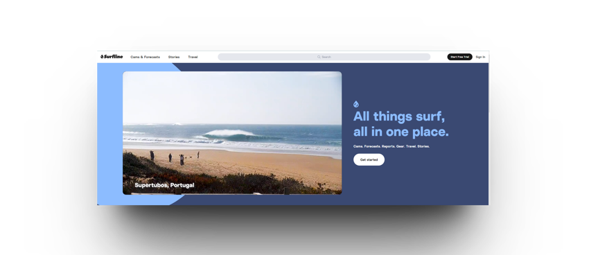
Surf forecasting site Surfline keeps their hero really simple, with a big video panel rotating through footage from their cameras, and a very to-the-point summary of their offer.
If your CTA is not prominent, doesn't stand out, or is unclear about what action visitors should take, it can hinder conversions.
The CTA in your hero is likely to be the most clicked item on your page, so ideally should be tailored to the stage of decision making process the user is at, but should also take into consideration the value of the product. Eg. for a £20 product, a ‘buy now’ button might be appropriate - for a £20,000 product, the customer probably needs a bit more nurturing before making a commitment - brochure demos, demo request or booking an appointment.
Being really clear on what your goal is for the page, and what the key considerations are before making a commitment to a product or service, will help dictate what the correct CTA is to move them along their decision making process.
Placement is also of huge importance. As a minimum we’d recommend a CTA button in the hero and at the end of the content, but on longer pages you may need to provide more opportunities to take action.

Trello reduce user friction on sign up by bringing their CTA right into the hero – enter your email to get stared, without even needing to click away to a separate Registration page.
The credibility of your brand is one of the largest considerations in your potential customers decision making process.
If your landing page doesn't feature customer testimonials, reviews, or security badges, visitors may hesitate to take action.
In addition, making sure that both the visuals and tone of voice are consistent with your overall brand style can have a significant impact on building trust between businesses and their potential customers.

Martech company Marigold places testimonials with client logos right on the homepage.
A cluttered or confusing layout can overwhelm visitors and make it difficult for them to navigate or understand your message.
Eye tracking research has found a number of different patterns of how users read on the web. Some users might read in F formation, while some might skip to key headings.
The key takeaway is that users will skim read. Long blocks of text will put them off.
A combination of effective white space, a visually appealing layout and clear headings or subheadings allow users to easily pick out the points that are relevant to them and guide them through your narrative, without demanding they read vast paragraphs of information.
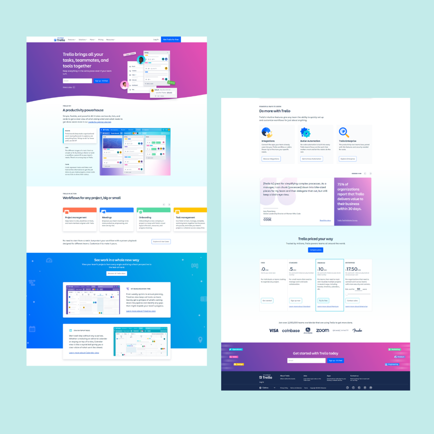
Trello use subheading images, blocks and colour to break up the page and help a user quickly skim to the piece of information they need.
If your landing page content doesn't address the needs or interests of your target audience, they may lose interest and leave without converting.
While the hero should quickly explain your product to a user, the body should address any reservations they have, ideally based on real user feedback.
If you fail to clearly communicate the benefits and features of your product or service, visitors may not see its value and be less likely to convert.
Benefit led headings, front loading sentences and passive copy style have been proven to aid skim readers and helping users to find key information/understand the value to them.
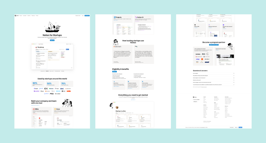
This example from Notion is geared to a specific audience – addressing the specific use cases for a Startup. And removing one of the barriers upfront – the cost.
If your form is too lengthy, requires too much personal information, or is not user-friendly, visitors may be hesitant to fill it out and convert.
As a business, you should consider what is the bare minimum information you require from them to nurture them, whether that’s through retargeting ads, or follow up from sales teams.
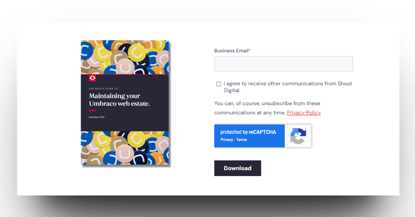
When we changed our 5-field form to just one for white paper downloads on our site, we saw the conversion rate double.
With the majority of internet users accessing websites through mobile devices, a landing page that is not mobile-friendly can result in a high bounce rate and low conversions.
With content managers typically editing in desktop view, it can be easy to forget to check those small screen views – especially in a B2B market where we know most users are still on desktop.
Images and text will often reflow nicely on mobile without much tweaking – but pay special attention to navigation, pricing tables and cookie pop-ups, which are common causes of a sub-par mobile experience.
And please check your page for enormous images that will slow page load for mobile users.
Your landing page should take into consideration the user journey up to this point.
If you’re investing in adverts to drive traffic to your landing page, make sure the page includes the information a user would expect.
If they’ve clicked on an advert promoting a specific product, the landing page should be consistent with the ad creative and supplement what they already know, taking them through the next logical steps of the journey.
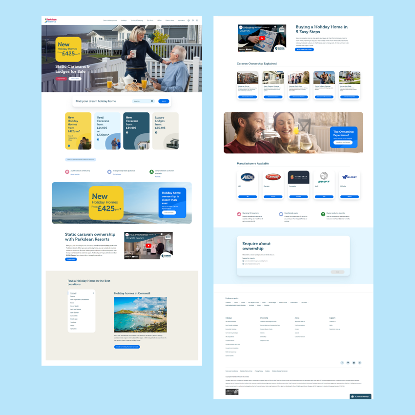
This example from Parkdean Resorts is the page that their Holiday Home Sales Google ad directs to. The page addresses the specific actions for that audience and allows users explore homes for sale, and how ownership works – or to jump straight into an enquiry if they are further on in their buying journey.
Modern content management platforms offer reusable components that can empower marketing teams to take ownership of their websites by focusing on specific goals, campaigns, or products.
With this flexibility comes the ability to veer away from the original UX design – for better or worse.
Creating effective landing pages requires considering the purpose of the page and thinking about the user the page serves when reviewing the page.
Then, use those flexible content components to walk them through your message.
Our team reflects on their highlights from this years innovation focused conference.
When you've taken steps to optimise your customer journey, why can conversion seem so difficult to grow?
Transforming the ICO's subject access request process with a simple online self-service process.