We're acutely aware of the importance of accessibility measures when it comes to designing digital products, but it is often all too easy to create something that simply looks great, and pleases the client (who often also may be lacking in knowledge when it comes to accessibility).
It’s only when you begin to look into some of the basic facts and figures and explore the different types of visual impairments, as well as the number of people affected, that you have your own eyes opened. It’s at this point it becomes your responsibility as a Designer to start actioning what you’ve learned, as well as educating your clients and teammates.
In this article, we explore the different types of visual impairments, and cover some of the basics when it comes to inclusive design, specifically focusing on how you can cater for users with visual impairments.
The Numbers
A common misconception with visual impairments is the number of people that are affected. Take a moment to think about your friends and family, how many people do you know with some form of colourblindness? For me, that’s 5. It’s also possible that some of your friends may not have even mentioned it!
The truth is, colourblindness affects approximately 8% of men, and 0.5% of women. If you’re developing a new mobile app and expecting around half a million or more of your customers to use it, it’s not unlikely you will end up with over 40,000 users having a very sub-par experience, and this doesn’t begin cover to those with eyesight that may be generally deteriorating due to age, for example.

Exploring the Different Types of Colourblindness
The first useful thing to know when it comes to describing and identifying different types of colourblindness is taking note to how the word ends:
‘opia’ - This is the most severe form of the condition described and will often result in substantial differentiation of how the person affected sees your digital product.
‘omoly’ - Indicates an abnormality rather than a total loss of the ability to see certain colours.
Deuteranopia / Deuteranomaly
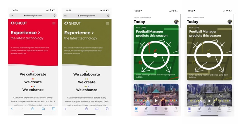
A form of red-green colour blindness where there no working / abnormal green cone cells. Reds will be seen as brownish/yellow and greens as beige, or users will have reduced sensitivity to green hues.
Protonopia / Protonomaly

Another form of red-green colourblindness where there no working / abnormal red cone cells. Reds appear as dark browns/mustard and certain shades of orange, yellow, and green all appear as yellow. With Protonomaly, users will have reduced sensitivity to red hues.
Tritanopia / Tritanomaly

A rare condition of blue/yellow colour blindness where there are no working / abnormal blue cone cells. Yellows and greens all appear as abnormal shades of blue, with blue colours themselves being off in hue.
Achromatopsia
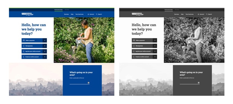
The rarest and most severe form of colour blindness, Cerebral Achromatopsia is a form of acquired colour blindness that is often caused by damage to the cerebral cortex of the brain, rather than abnormalities in the cells of the eye's retina. As a result, the world is seen in greyscale.
What can we do about this?
Here are some quick wins when it comes to ensuring your design is inclusive and has considered users with visual impairments…
1. Mention colours in words when it matters
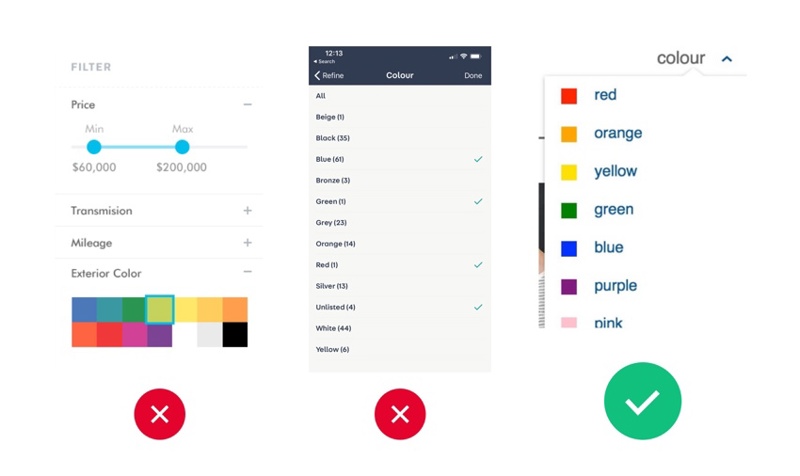
Assess if you need to mention/identify the colour of something. This can be particularly important for users with colourblindness when buying items online such as clothes, or using a colour filter for example.
2. Seek combinations with higher contrast
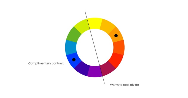
Colours on the opposite side of the spectrum will often provide a high level of contrast for all users. You can also try using a warm to cool colour contrast.
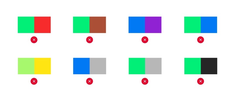
3. But, avoid these colour combos
These colour combinations should be avoided if possible in order to cover all basis of colourblindness.
-
- green/red
- green/brown
- blue/purple
- green/blue
- light green/yellow
- blue/grey
- green/grey
- green/black
4. Try it in greyscale
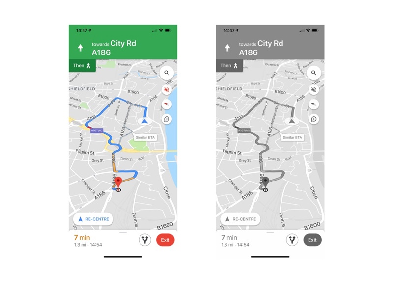
Test your designs in greyscale, does it still work? Is everything clear with adequate contrast? De-saturating your design work is a great way to check contrast levels, and it’s also how a very small portion of users may be viewing your digital product/service. As we can see here, Google Maps has great contrast between key elements that make up it’s naturally busy UI.
5. Make sure everything scales correctly
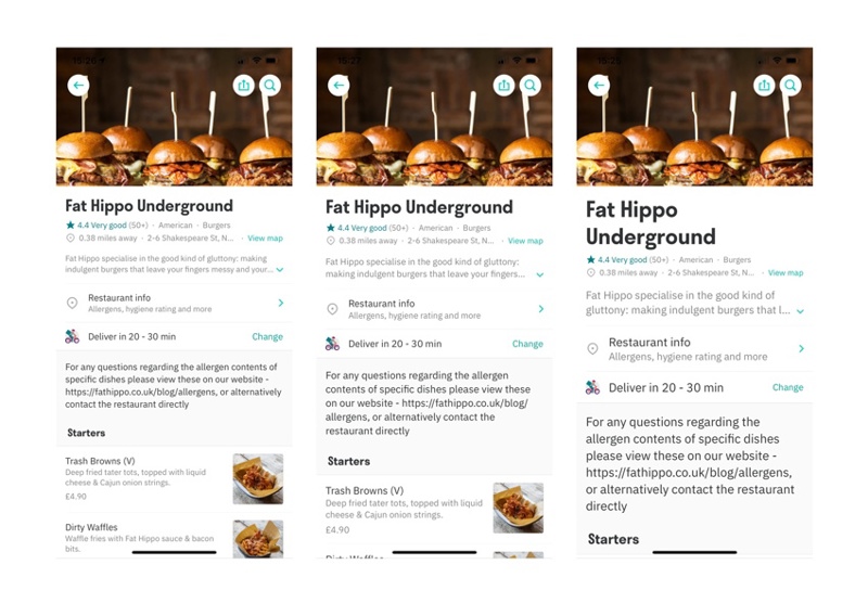
If a user struggles to see small text/assets there’s a high chance they’ll have their device or browser set up to zoom the interface to make it easier for them to see. A text label may fit an area of your interface perfectly at 14pt but what happens to that same label when it’s enlarged by the OS/browser to 18pt? Work closely with developers and QA to test this and cater for it where possible. Deliveroo’s interface scales well, but certain labels are left out such as star rating, cuisine, distance etc.
6. Use Design Guidelines and Online tools
There is a wealth of online resources and tools that will provide extensive knowledge and guidance when it comes to best design practice and accessibility. Here are some of the most important and useful:
-
- Human Interface Guidelines from Apple
- Accessibility by Material Design
- Color Tool by Material Design
- Color Oracle Simulator
At Shout, we use a plugin called Stark in Sketch and AdobeXD to make sure we’re producing accessible user interfaces for our clients, and more importantly, their users and customers.
For testers, product owners and more general users, the WAVE Web Accessibility Evaluation tool is available as a Chrome plugin, and can give vital clues about the general accessibility status of any webpage.
Do it Right.
With all of the moving parts and complexity that software development brings, it’s easy to skip over some of the smaller, edge-case aspects of a project in order to meet deadlines and deliver a solution on time. In our experience, it’s these smaller aspects which often turn out to be critical for the success and longevity of the final product. Basic accessibility is one of these ‘smaller’ aspects.
Piqued your interest?
To discuss your latest business challenge and see how we can help, get in touch today