


In part 2 of this 3-part series we set up React Router so that we can navigate the pages of our site using the <Link> element, integrating with the Content Delivery API to deliver content per page without full page refreshes.
In the final part we’ll expand the type of content we support to use the Grid Block Editor, recreating the Razor views that ships with Umbraco into reusable React components.
Preparing the environment
Setting Up the document types
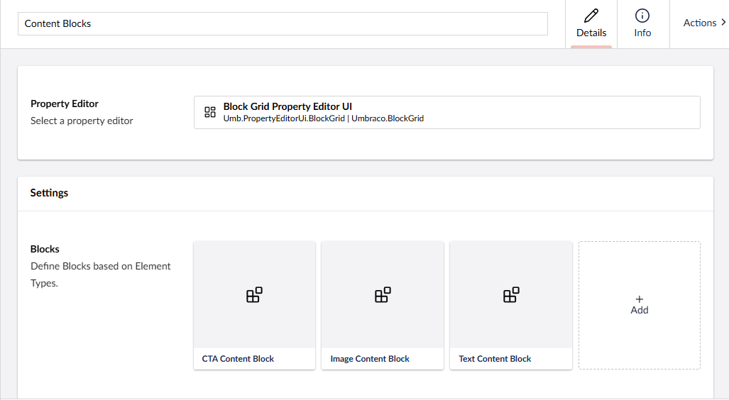
Under Document Types, create a new folder and call it “Blocks”. In here create 3 new Element Types:
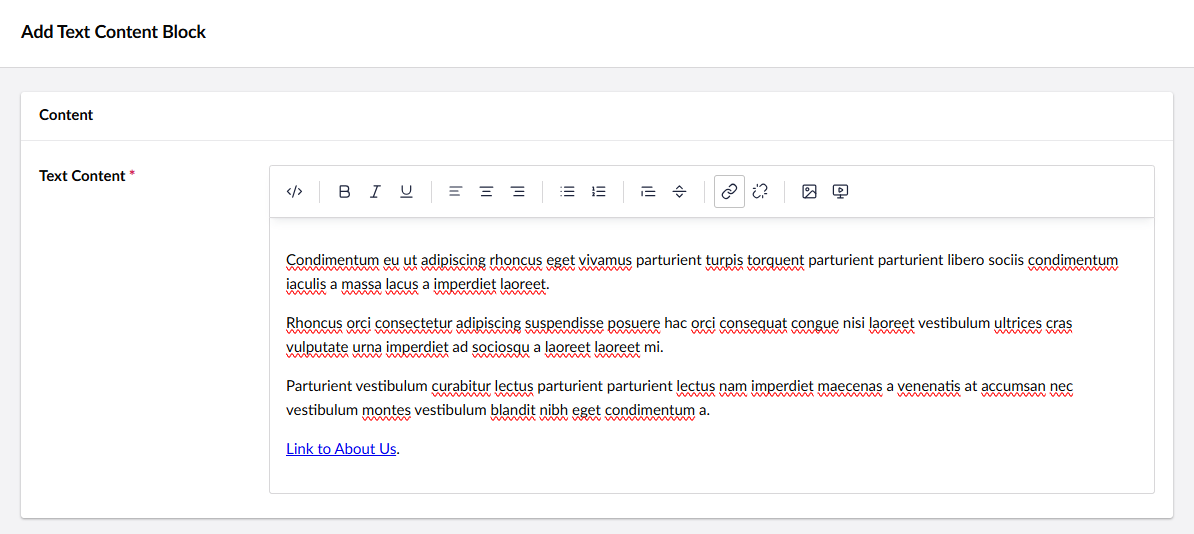
1. “Text Content Block” with the following properties:
- New tab called “Content”
- New property called “Text Content” - Rich Text Editor
- It’s up to you whether your choose Tiny MCE or Tiptap here, I chose Tiptap as TinyMCE will be removed in v16.
- New property called “Text Content” - Rich Text Editor
2. “Image Content Block” with the following properties:
- New tab called “Content”
- New property called “Image” - Image Media Picker
3. “CTA Content Block” with the following properties:
- New tab called “Content”
- New property called “Big text” - Textstring
- New property called “Link” - Multi URL Picker
- Select new configuration and set the “Maximum number of items” to 1
Setting Up the data types
Under Data Types create a new data type called “Content Blocks” using the “Block Grid” property editor.
In the blocks property select the 3 document types we created in the previous step.
Finally select our Content Page document type, create a new tab called “Content” and create a new property called “Content Blocks”.
For the property editor select our “Content Blocks” data type, and save the document type.
Setting Up the content
In part 2 we created 4 pages in our site: Home, About Us, Our Work, and Get in Touch. For the purposes of this article you can add any combination of blocks to these pages, and populate them with any content you wish. One thing we would recommend doing however is adding a link to another page within the rich text editor, and this is so we can take a look at a potential problem later on.
Setting Up the frontend
Now that we have our pages populated with content from the Block Grid Editor, let’s set up our React components so that we can display the content to our users.
For that we’ll need to create 4 components: 1 which will act as our main content blocks renderer, and 1 for each block.
In your clientapp/src folder create a new folder called Blocks, and create 3 files that correspond to the document types aliases of our blocks:
- ctaContentBlock.tsx
- imageContentBlock.tsx
- textContentBlock.tsx
Open ctaContentBlock.tsx and add the following code:
import { Link } from "react-router";
import { UmbracoLink } from "../lib/umbracoTypes";
function CtaContentBlock({ content }: { content: CTA }) {
const link = content.link[0];
return <div id="cta-content-block">
<p className="big-text">{content.bigText}</p>
{link && link.route?.path && <p>
<Link to={link.route.path} className="button">{link.title}</Link>
</p>}
</div>
}
type CTA = {
bigText: string,
link: UmbracoLink[]
}
export default CtaContentBlock;
Note: We are typing our content parameter to CTA here. For the purposes of this article we’re including the type within the component itself, but for a real world build you might move this to a separate file in the /lib folder.
Our CTA component is quite basic, we’re simply rendering out the big text followed by a button link. So that our link routes through React Router, and we get our nice transition between without a full page refresh we use the Link component from React Router.
Our imageContentBlock.tsx is equally straightforward:
import { UmbracoMedia } from "../lib/umbracoTypes";
function ImageContentBlock({ content }: { content: Image }) {
const media = content.image[0];
return <div id="image-content-block">
<img src={`${media.url}`} width="100%" />
</div>
}
type Image = {
image: UmbracoMedia[]
}
export default ImageContentBlock;
Note: There may be occasions where the image you’ve selected in the CMS is no longer available e.g. it might have been deleted from the media library. In that instance the image will be null here, so for real-world builds you should always check to make sure the image exists before using it. To keep our code simple, we’re omitting this.
Our textContentBlock.tsx looks like this:
import { UmbracoRichText } from '../lib/umbracoTypes';
function TextContentBlock({ content }: { content: RichText }) {
if (!content.textContent?.markup ) {
return;
}
return <div dangerouslySetInnerHTML={{ __html: content.textContent.markup }} />;
}
type RichText = {
textContent: UmbracoRichText
}
export default TextContentBlock;
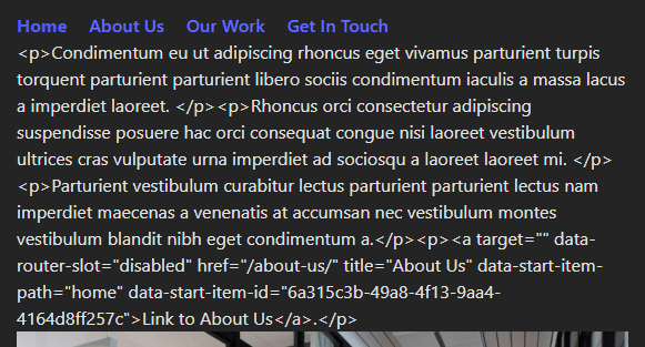
You’ll notice that we’re rendering our content into a div and setting the dangerouslySetInnerHTML property. This is because if we didn’t set it like this, if we just returned content.textContent.markup then the front-end would render out “safely”. By that I mean it encodes our content and users will see HTML elements, like this:
You are advised to read the docs on this approach just so you understand the risks of using dangerouslySetInnerHTML. For our purposes, because we know and trust the source (which is our CMS), it’s fine to use it.
Next up we’ll create our main content blocks component. In the clientapp/src folder, create Blocks.tsx and add the following code:
import CtaContentBlock from "./Blocks/ctaContentBlock";
import ImageContentBlock from "./Blocks/imageContentBlock";
import TextContentBlock from "./Blocks/textContentBlock";
const Blocks = ({ blocks }: { blocks: any }) => {
return blocks.map((block: any, blockIndex: number) => {
const key = blockIndex + "-" + block.content.id;
switch (block.content.contentType) {
case "imageContentBlock":
return <ImageContentBlock key={key} content={block.content.properties} />
case "textContentBlock":
return <TextContentBlock key={key} content={block.content.properties} />
case "ctaContentBlock": return <CtaContentBlock key={key} content={block.content.properties} />
}
})
}
export default Blocks;
This component receives an array of blocks. It’s looping over each one using .map(), checking the alias of the document type, and rendering out the appropriate component.
Finally we can update App.tsx to replace our <Content> component with our new <Blocks> component, so make the following changes:
Replace import Content from './content'; with import Content from './content';, and replace <Content content={pageData}></Content> with <Blocks blocks={pageData?.properties.contentBlocks?.items}></Blocks>.
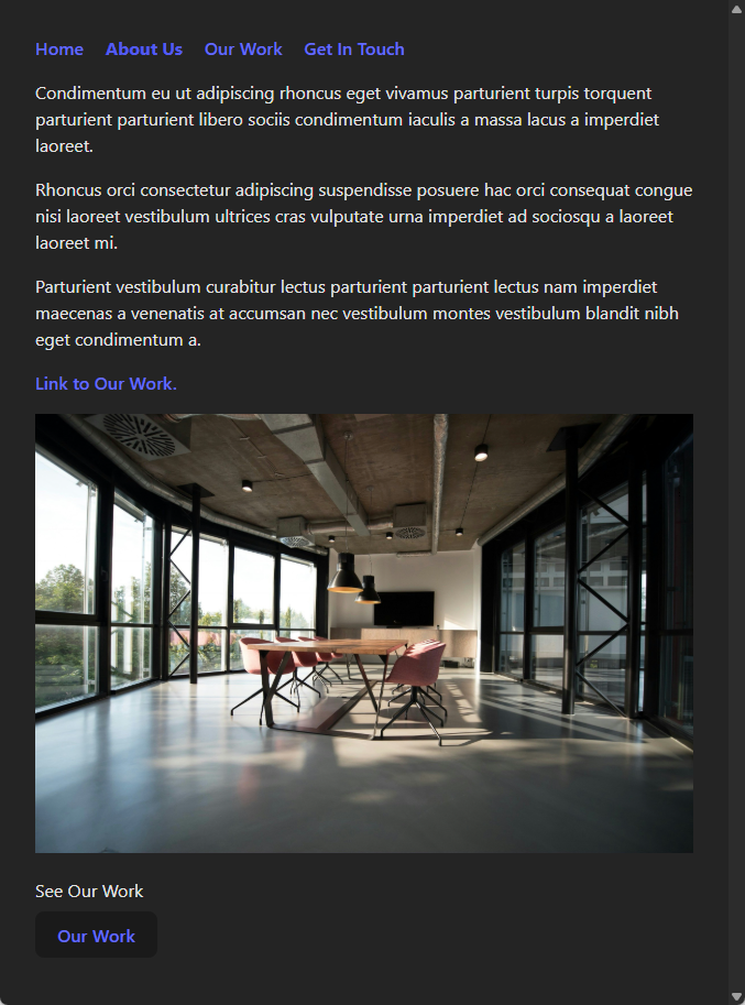
And that’s it. We can now run our site, click around our navigation and we should see our content blocks being rendered out:
Note: We’ve updated our CSS so that it looks a little nicer than it did. Styling is outside the scope of this article, so you’re free to do whatever you wish here.
All good so far, but let’s look at a potential problem. We are using React Router to handle our site’s navigation so that we don’t get full page refreshes, but if you click the link that we added to our rich text editor (in the image above that’s the “Link to Our Work” link) you will notice that it does a full page refresh.
It does this because our rich text editor within Umbraco doesn’t know we’re using React Router… it doesn’t know or care what we’re using on the front-end, so it returns a standard <a> element. React doesn’t do anything special with these elements so it lets the browser handle it as a normal link and our page refreshes.
Depending on your POV this could be a minor issue or it could be a major one. If your site is a basic personal blog it might not be a deal breaker, but if this a client’s website and there is a consistent UX for links between pages (for example you might have an animation transition between pages), then this is a problem. Luckily there is a simple solution.
To solve this we need to intercept clicks and route them through React Router. To do that we’re going to use React’s onClick event handler.
Open textContentBlock.tsx and add the following to the TextContentBlock function, just above our return:
const navigate = useNavigate();
const contentClickHandler = (e: any) => {
const targetLink = e.target.closest("a");
if (!targetLink) return;
e.preventDefault();
navigate(e.target.pathname);
};
Add an onClick handler to the div we are returning so that it returns
What we’re doing here is is we are handling clicks that occur within our text content block <div>. We check to see if we’ve clicked an <a> element, and if we have then we intercept this click and prevent the browser from handling it. Finally we use React Router’s useNavigate hook to handle the link for us.
Now if you click links on your site, you should see a seamless transition between pages.
Conclusion and downloadable example project
In this article we added the Block Grid Editor into our website so that we could render our richer content on the front-end.
We also handled a potential issue with our text content block using React click handlers and React Router hooks.
This concludes our introductory series, but there are some next steps that you could try yourself to take this further:
- Add Block Grid layouts and areas into the equation. We’re using a very flat structure for our site, but the Block Grid Editor supports layouts, nested layouts, and areas
- Use a library such as Motion to create an animated transition between pages
- Install Umbraco Forms, render the Form to the front-end, and handle the form submission
If you found this series useful, and you’ve used the skills learned in your own projects we’d love to hear from you.
As always you can find the sample project here.

Building a React frontend for an Umbraco headless CMS | Part 1
02/04/2025
Using a worked example, our Umbraco experts walk you through using Umbraco’s headless APIs to work with a React frontend.

Building a React frontend for an Umbraco headless CMS | Part 2
17/04/2025
The second part of our content series on using Umbraco’s headless APIs to work with a React frontend—here we deep-dive on React Router.