
Can you remember the last great experience you had when using a digital platform? How did it change your expectations moving forward? Was it a small change or a paradigm shift? Did it render your previous experiences with similar platforms obsolete or just nudge the bar up a little?
Whatever your reaction, this new normal is what we measure all of our experiences against moving forward and so it’s up to us, as the creators of these platforms, to measure up.
But why is this even important at all?
Because it usually only takes seconds for a customer to decide whether or not they are satisfied with the customer service you’ve provided. This quick, initial, unconscious reaction is often the main driver behind whether or not a customer will ever use your platform again, and so it’s this reaction that we need to assuage.
So, how do we do this? By understanding their goals and their priorities and working backwards from there. These usually include:
-
Does this platform let me do the things I expected to do?
-
Does it help me to access the services I want by structuring the information architecture and content hierarchy in such a way that key services are given the highest priority?
-
Does it look visually appealing, and does the aesthetic match the tone and type of services it provides?
-
Is the platform technically responsive?
-
Can I access the platform of multiple device types seamlessly?
- Does it do all of these things as good, if not better than their competitors?
- Does it make my life easier?
As designers, we need to have a robust understanding of who the users are, what they understand about interacting with digital products and what success looks like from their point of view. If we don’t, then there’s a good chance that what we produce will fall below their expectations.
You never get a second chance to make a first impression.
Will Rodgers
A poor impression
First impressions count, and so some of the problems that users find can immediately colour their long-term view of your business. If you're aware that your platform has any of the following concerns then there's a good chance you are going to lose customers - usually to competitors who have ongoing programmes of customer-centric, continuous improvement.
-
The layout and content hierarchy is confusing
-
The platform doesn’t seem to offer the services I thought it did
-
I can’t find the things I want to.
-
Some of the ways the site operates are confusing and don't match common digital patterns and behaviours.
-
The content and signposting is strange or doesn’t match the tone I expect.
- I can do the same, but easier elsewhere.
Ensuring that these problems don’t raise their heads is always at the forefront of our minds when creating digital experiences as the difference between setting good expectations and having to generate a customer's trust after a bad experience is huge.
Newcastle Airport - Case study
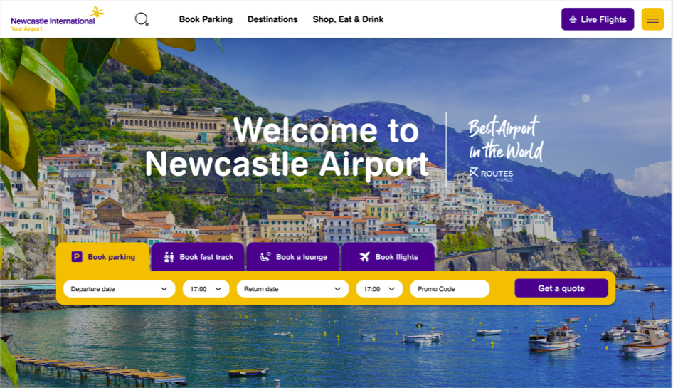
The goal: Overhaul of the UX and UI to transform the ability for customers to book airport services and destinations, as well as view airport information.
Managing the initial customer perception and reaction is something we were keenly aware of throughout the discovery and design process. We needed to ensure that when a user began using the website they felt as though the content structure had been created with their goals in mind, with the content hierarchy prioritising their most pressing and repeatable needs first, while offering secondary and tertiary solutions further down the page.
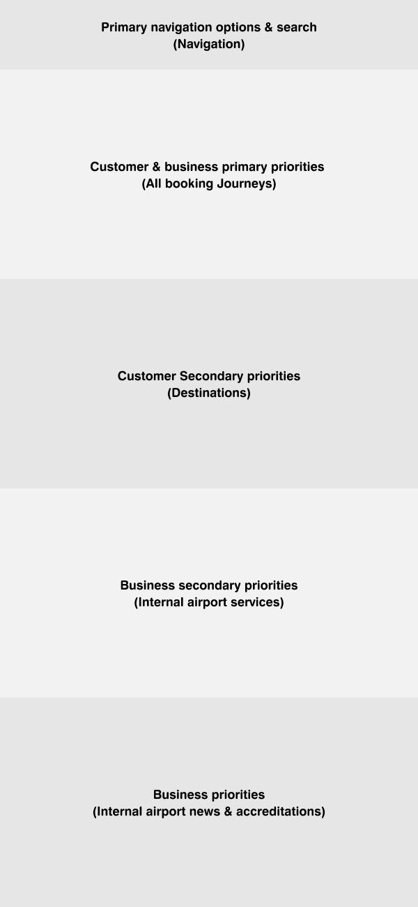
Key priorities
For Newcastle Airport, these primary concerts were:
-
Booking parking, fast check in, lounges and flights
-
Quicklinks for booking parking, viewing flight destinations and airport services
- Search
-
Viewing live flight data
When interacting with customers we found that these options catered for a significant proportion of their overall needs, meaning that we could use the remaining real estate for important, but secondary concerns.
Visually, we also needed to use the existing brand, as well as thematically appropriate imagery to delight the user by generating an aspirational feel to the overall experience.
However, this isn’t the end of the story. With new technologies comes new opportunities and this could present itself in a number of ways for newcastle airport such as:
AI & LLM & limited UI
If a customer was looking to book a parking spot then we could give them the option to use AI to streamline the process. Using the website, or more likely, the app, they could say ‘I want to book parking from the 2nd of August until the 10th’, and then the AI would ask a series of contextual, follow-up questions using conversational language and internal business logic to filter the available parking options down to find the one that suits the customers goals. . The customer won’t have to worry about interacting with forms or calendars, with the only UI component potentially being lists of options, or to review the confirmation of the booking.
This increased simplicity will be of huge benefit to most users, but especially for those who have difficulty accessing services normally, and this frictionless experience is something that, if done correctly, would leave an amazing first impression and hopefully, lead to the start of a long and fruitful relationship.
Changing hearts & minds
How customers perceive you initially will define their overall relationship with you. If the experience is good, and then you make some mistakes, you can usually be assured of some leeway. They will believe that the good is your ‘default’ state and that this is a small, temporary drop in quality. If the initial impression is bad, then the opposite is true. Customers will believe that you are a company who generally delivers a sub-standard experience, and any upsurge in quality might just be a short term anomaly.
Of course, sustained levels of good or bad experiences can change this perception, but that takes time and effort, and in today’s hyper-competitive market, you may only get one chance.